B2B Marketing: Landing Page Best Practices
Ready to boost your SEO ?

B2B Marketing: Landing Page Best Practices
Landing pages are created to direct visitors into a certain action, thus converting them into qualified leads. It may sound simple, but effective landing pages must capture your visitors’ attention enough for them to submit their valuable lead generation information into your website. So, how do you create a lead-generating landing page for your B2B website?
Here are 5 elements that make up a great B2B landing page:
-
Simplicity. It is important to keep the attention of your visitor once they arrive on your landing page. A good landing page (on any website) should have one singular purpose, as to keep the page simple and clean. Don’t let your visitors get distracted by links or navigation items, instead focus on the one clear conversion point for the page.
-
Great copy (and/or visuals). Landing page copy should immediately describe the benefit of the offer being presented. This does not mean that the text should be “salesy” but instead it should provide information that the visitor will find useful and want to know more about. Great copy does not include fluff words that waste precious page space. Get right to the point and get there within just a sentence or two and your visitors will thank you.
-
Excellent form. The landing page form is meant to profile and qualify visitors into leads. It is a perfect opportunity to collect information, but should not be overwhelming or cumbersome for visitors. Landing page forms on a B2B website should be short and used to collect a few essential pieces of information (name, email, website, phone number, etc.) without getting too in-depth. The form is used as a baseline for beginning the lead generation funnel. In general, the more fields on a form, the more work for the visitor, and the less leads generated.
-
Honesty. Trust is essential in gaining excellent leads, which is why you should never dupe your landing page visitors. Make sure that the messaging in your corresponding call-to-action, as well as the headline of the landing page, match the offer you are providing. An effective B2B landing page reflects exactly what is promised to visitors.
-
Great Reward. Don’t forget about the offer itself. Whatever is promised in the landing page should be delivered through the offer. For example, if someone downloads an Ebook about Internet Marketing, make sure the Ebook is high quality and matches what they were looking for. Just remember that great content will reward itself!
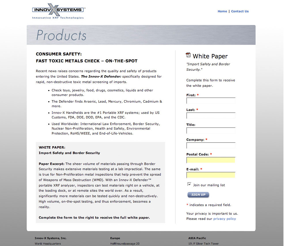
Here is an example of a B2B landing page that Bartlett Interactive designed for Innov-X Systems.

If you would like to learn more about B2B landing pages, see the Landing Page Optimization info on our website.
with a Booster program for Healthcare companies.

