Best Practices for a B2B Home Page Website Design
Ready to boost your SEO ?

Best Practices for a B2B Home Page Website Design
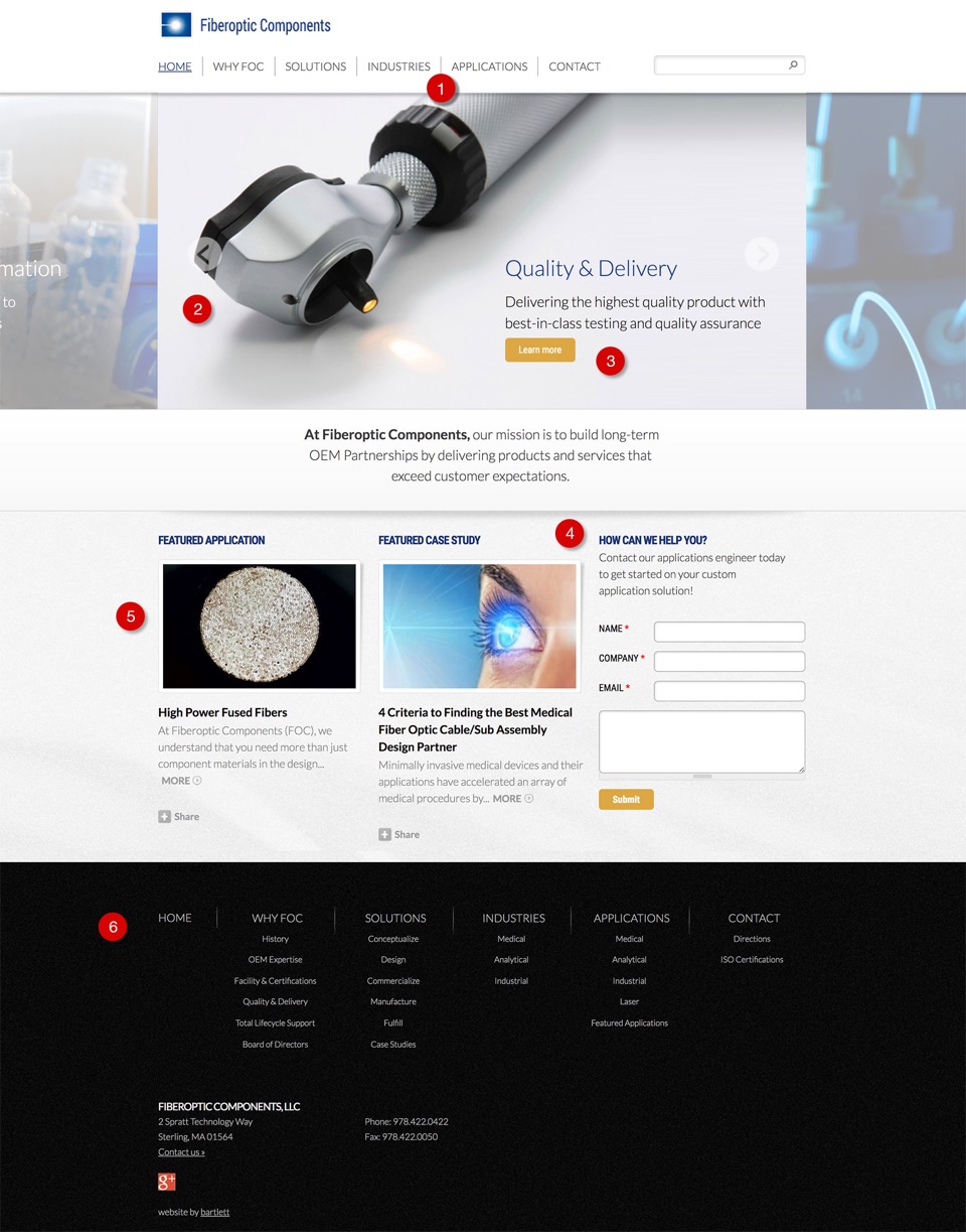
We designed and developed a site for Fiber Optic Components (FOC), a leading manufacturer of OEM fiber optic light guides, cables and subassemblies. We’ve broken down the home page design into what we believe are best practices for B2B OEM company websites.

The numbered sections below correlate to the numbers in the screenshot above
1. Navigation - Solutions, Industries & Applications
Since FOC develops products as well as customizes them for OEMs, it’s important there are multiple options in the navigation. We used personas to better understand what each audience type needs. We then decided with the client that there should be 3 primary navigation links for people to understand what FOC does: Solutions, Industries, and Applications.
2. Billboard Scroller
This area displays multiple solutions, applications, and industries and automatically scrolls on its own. Large high-quality stock photography was purchased at a minimal cost. These photos dominate the page and the quality of the images directly affects the quality of the overall design. Adequate time should be spent to find the best images possible.
3. Calls to Action
Each billboard message has 3 parts: a headline, sub-headline and a call to action to move the prospect down the funnel.
4. Conversion
A call to action including a form offers a conversion opportunity on the page. The broad question “How Can We Help You” keeps it open so multiple types of questions can be asked.
5. Featured
Including a Featured application and case study provides an opportunity to promote certain target markets.
6. Footer
The footer includes all of the navigation for the site. This is dynamically generated so if a page is created or deleted it will automatically be displayed in the top and bottom navigation. This makes it easy for a prospect to understand the whole site at a glance. Search engines also like to see navigation expanded and displayed clearly like this in the footer.
To get more ideas and inspiration on top web design trends to watch for in 2018 check out what the experts have to say on Bookmark's blog.
with a Booster program for Healthcare companies.

