Recent Trends in Library Website Design
Ready to boost your SEO ?
Recent Trends in Library Website Design
Library website design continues to evolve rapidly and COVID has accelerated the need for an effective online presence. Innovative platforms, plugins, and themes are meeting this need in a variety of ways including compelling pre-designed themes, page editing and workflow tools, and easier ways to integrate 3rd party apps that provide streaming video, calendars, meeting room reservations, and museum passes.
As part of our research when designing a new library website, we look for better ways to improve the design, functionality and visibility of the new site. What follows are 9 sites that exemplify recent trends in public library website design.
Seattle Public Library
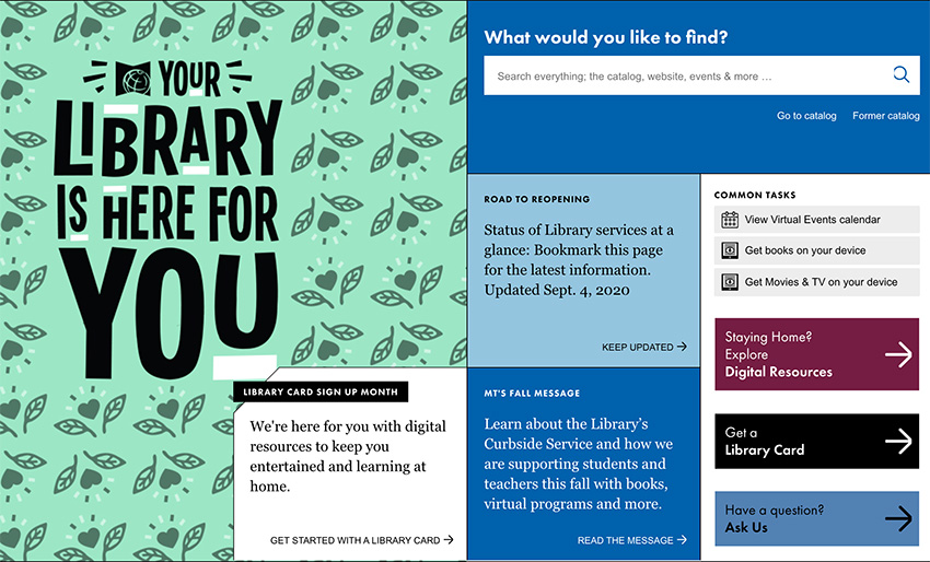
- A well-designed events calendar - we love the search and filter sidebar and the monthly view is useful to find events on specific days. Additional filtering allows you to search by keyword, event type, author readings/lectures, book group, class, homework help, and location.
- A modern, modular look - the colors are mostly neutral with pops of color to draw the user in further. It’s easy to find what you need.
- The main nav is sectioned into different tabs, and the search tab is easily accessible.
- An effective 'secondary footer' for calls to action - Subscribe, Ask Us, and Support Your Library.
- The “common tasks” section is great for getting users directly to the content they might be looking for without further searching.
- The staff picks book section is done well including the ability to choose different categories.
- Nice use of alert bars that are closeable.
- Some of the add on technologies used include: BiblioCommons, Google Translate, and Trumba.
Platform: Microsoft ASP.NET
See the site.
New York Public Library
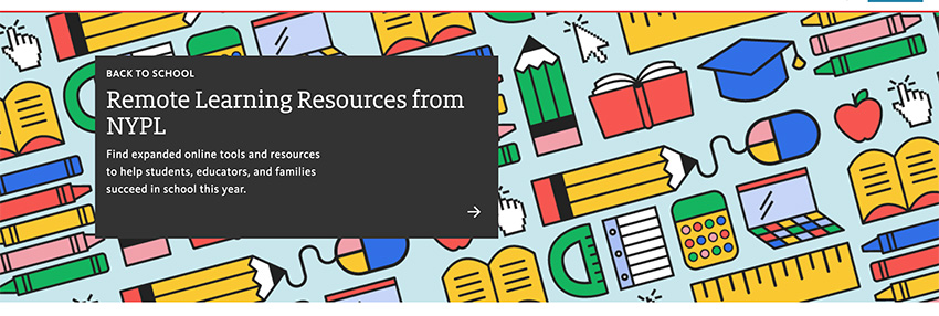
- A well-designed events calendar - it’s very clean and easy to navigate. You can select upcoming events, exhibitions, author talks & conversations, and performing arts & films. You can select to see more of each type of event and be taken to a new page that sorts the events by “on now,” “coming up,” and “archives.”
- A modern, clean look - the color red is used purposefully to draw the user’s eye and make the site easier to use.
- The location finder - users can view locations in either a list format or a map view. They also have the option to search for libraries near them or research libraries.
- Library location info includes accessibility information, highlighted amenities and the hours for that day.
- The short comments about books in the staff picks section is personal and fun.
- Some of the add on technologies used include: BiblioCommons, Optimizely, Google Optimize 360, OptinMonster, AddThis, and Facebook Workplace.
Platform: Drupal, React
See the site.
Houston Public Library

- The simple, prominent search function allows an easy way to search the website or the catalog.
- Effective branding - the red color found in the logo is used throughout the site’s style without being overwhelming.
- Use of images and a professional design of the mega menus of the main nav help visually break up the items found under each menu item.
- A simple and effective use of a horizontal slider for books celebrating Hispanic heritage.
- The location search allows you to filter locations by “open now”, “open tonight”, and “open weekends.” This is very unique, and very useful!
- Some of the add on technologies used include: Twitter Timeline, AddThis, and Facebook Like.
Platform: Drupal
See the site.
Baltimore County Public Library
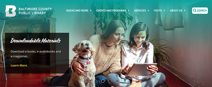
- A clean, easy to use design follows established rules of Library sites, yet allows for refreshing aspects to flow throughout the site
- A horizontal scroller for viewing books, DVDs, and audiobooks - including tabs to filter results
- An “adjust contrast” feature that changes the color contrast of the page
- Google Translate
- Interesting use of typography
Platform: Angular JS, Microsoft ASP.NET
See the site.
Saint Paul Public Library
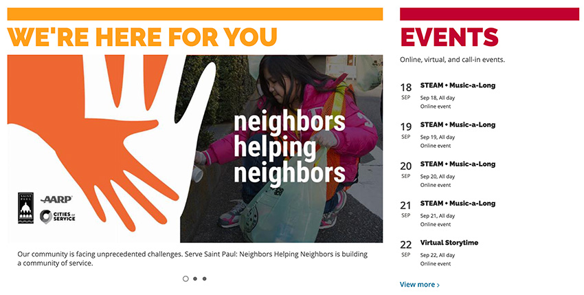
- A robust, advanced search function - you can search the catalog, website, FAQs, or events and narrow your search even further by choosing keyword, title, subject, series, tag list, or user.
- A modern, clean, and colorful design - very inviting and the use of color helps to successfully organize the content for users.
- Effective use of CTA’s under “Browse Books” including Book Clubs, Book Club in a Bag, Get Reading Suggestions, and NoveList Plus.
- Some of the add on technologies used include: Niche Academy, Gravity Forms, Mail Chimp, bbPress, BiblioCommons, Beaver Builder, RSS, and Semrush.
Platform: WordPress
See the site.
Clifton Park Halfmoon Library
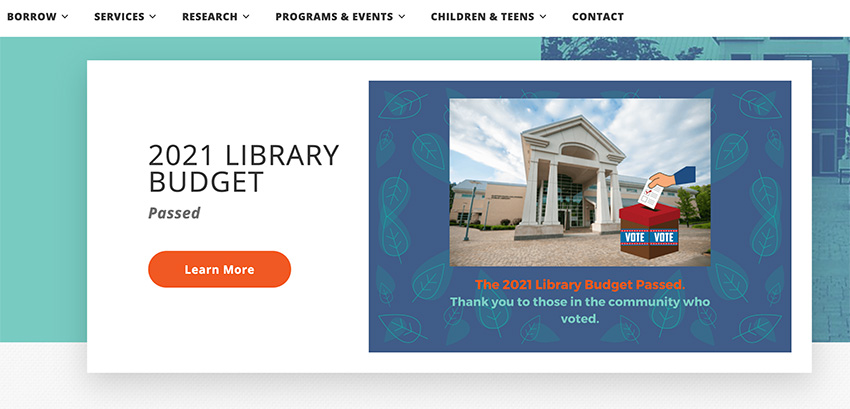
- An effective search function that allows users to filter between books, movies, events, and websites.
- A well-designed events calendar - th drop down menu lets the user search for all events, events for children, teens, and adults, view the program brochure, or suggest a program. Once you make a selection, you are taken to a weekly calendar that shows you all of the events happening that week.
- A modern, clean, colorful design. The use of patterns and textures gives the website a cohesive look.
- The quicklinks in the top right corner allows for quick and easy access. We love how the mobile menu is divided into “Quick Links,” “Menu,” and “How Do I?”
- The digital content iconography on the homepage. It’s creative and eye-catching!
- Some of the add on technologies used include: Gravity Forms, Rocket Chat, Yoast (SEO), Facebook for Websites, Really Simple Discovery, and Live Writer Support.
Platform: WordPress
See the site.
Downey City Library
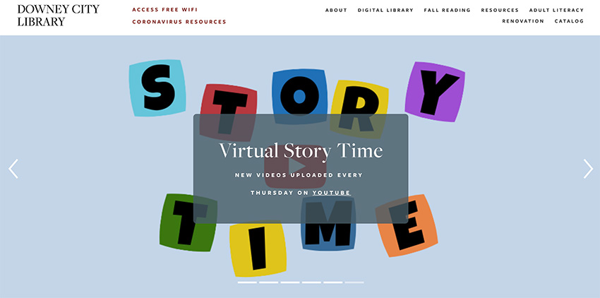
- Large well-designed hero image that grabs your attention and cycles through the most important announcements.
- Digital services offered right up front, prominently displayed on the homepage. This is crucial for a library’s website, as it is the hub for your digital services. Just like how a patron sees shelves books immediately when they walk into your library, you want them to see digital content right when they enter the website.
- Some of the add on technologies used include: Twitter, UserWay, Facebook, Youtube, and RSS.
Technology: SquareSpace
See the site.
Central Arkansas Library Systems
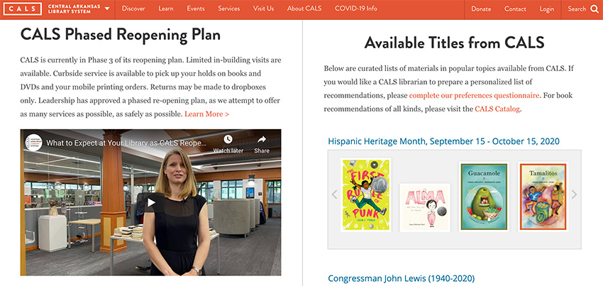
- Fully responsive and easy to use on mobile.
- Clean attractive design. Good use of colors for brand consistency. Plenty of white space, making it easy to read. Great use of brand consistency throughout the site.
- One upcoming event featured at the top without a changing slider. Additionally, three events are offered right at the top of the homepage with 3 featured events. The simplicity makes it clear for users to see which events might be most popular to attend.
- Some of the add on technologies used include: Facebook, Yoast, Wufoo, MailChimp, Wordfence, Unsplash, WooCommerce, Blackbaud, Youtube, RSS, Really Simple Discovery, and Live Writer Support.
Platform: WordPress
See the site.
Evanston Public Library
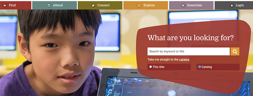
- Effective use of colors to distinguish between main menu items helps you focus on each one, especially on desktop.
- The main nav is sectioned into different tabs, each with a relevant icon. We love icons! Making content visual wherever possible is a great way to help users navigate a site with ease.
- The mobile app and a page dedicated to download instructions and benefits of using the app.
- Some of the add on technologies used include: Yoast, Add to Any, Schema markup, Google Maps, and Google Apps for Business.
Platform: WordPress
See the site.
These examples are a few of the ways library websites are evolving to meet the demands of an increasingly sophisticated patron base. The benefits of these new trends and the innovation they manifest include:
- Visually compelling user interface and user experience design
- Easier to use front-end tools for publishing content
- Easier to use websites that meet accessibility standards
- More effective integration and promotion of 3rd party apps that provide streaming video, eMagazines, audiobooks, and DVDs.
- Lower cost, easier to use, and more capable platforms such as WordPress and Drupal and their respective plugins.
How is your library website performing? If you would like to have a detailed audit of your website, submit this form and we will respond soon.
with a Booster program for Healthcare companies.

