5 Factors That Make a Library Website Easy to Use
Ready to boost your SEO ?
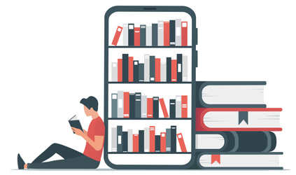
5 Factors That Make a Library Website Easy to Use
Ease of use may be invisible, but its absence sure isn’t.
IBM
We all know ‘easy-to-use’ when we see it, but what makes an easy-to-use library website? This article outlines 5 factors that contribute to ease of use based on our experience designing library websites and conducting research since 2012. Best practices in these areas are also included in the LibWeb platform we created. See more about LibWeb as well as a video that accompanies this blog post.
Here are the top 5 factors:
- User Interface Design (UI)
- Navigation
- Search
- Accessibility
- Content
1. User Interface Design (UI)
Users strongly prefer website designs that look both simple (low complexity) and familiar (high prototypicality).
Google Research
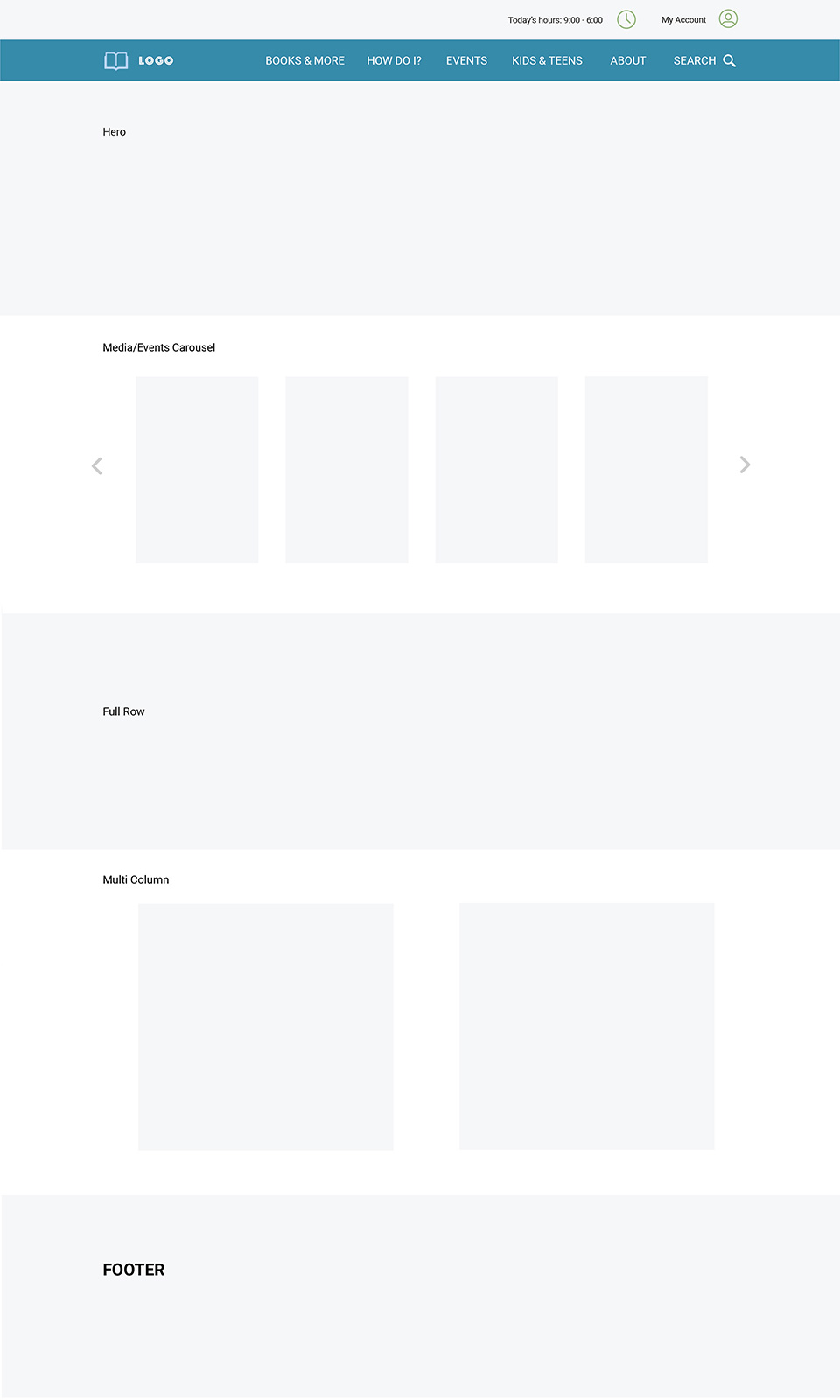
The UI is the foundation of an easy-to-use site and where sites often become too complex and difficult to use. Let’s first look at the structure of the UI. Here’s an example of a simple layout showing the header, content, and footer sections. Note the different content styles e.g. card style, full row, and multi-column.
What follows are more detailed components of the UI and best practices.
Layout
This includes the header, content area, and footer. The layout should be ‘simple and familiar’ as shown in the example above.
Whitespace
Studies have shown that effective use of whitespace increases comprehension by 20%. Using too little reduces readability and too much decreases engagement. Often 50% of the page is an optimal amount of whitespace.
Color
When too many colors are used a web page becomes difficult to scan and understand. The general rule is 3 colors or less. The 60-30-10 rule has gained traction whereby a dominant color is used 60% of the time, a secondary color 30%, and an accent color is used 10%. This also provides a hierarchy that reinforces simplicity.
Typography
Here are some guidelines - use 3 fonts or less for the whole site, paragraph text should be 16 pt or larger, line height should be about 150% of the font size, sans serif fonts are easier to read than serif for body copy, serif fonts are fine for headlines, optimal paragraph line width for mobile is 35 characters and 70 for desktop. The list goes on, learn more – just keep in mind typography is critical for readability and useability.
Mobile
How responsive the design is for different screen sizes is foundational to an easy-to-use site. Hiring a web designer that understands ‘Responsive Web Design’ is critical especially since most patrons access websites with a mobile device. Historically the web design process focussed on desktop and the mobile design was reviewed after the desktop version was approved. Following a ‘Mobile First’ approach is a best practice.
Simplifying the UI makes it easier for patrons to scan and comprehend a page. Deviating from this approach is one of the most common mistakes that make websites harder to use i.e. overly complex layouts, too many colors, different fonts., and lack of mobile optimization.
2. NAVIGATION
Over 70% of participants began by clicking on a link as opposed to using the search feature, and users often gravitated to search when the links on the page didn’t satisfy them.
WebFX
Patrons often cite not being able to find what they are looking for as the biggest issue with library websites. The example below shows a website’s primary navigation and header as well as a mega menu displaying links within each section of the site. This is persistent navigation on every page. Note there are 2 rows, the top is for administrative info like hours and an account login to the library catalog while the second row is for the site navigation ending with a search feature. The logo has plenty of air space so it isn’t cluttered by the navigation and the nav links are upper case distinguishing them from the above admin row and providing more weight.
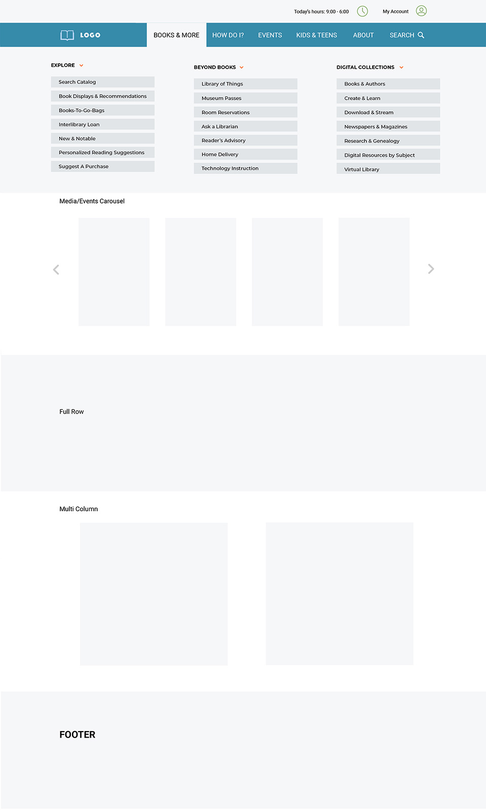
Note the header can be sticky as well, i.e. the header stays at the top of the page even when the patron scrolls down so it’s always accessible. A mega Menu, as shown below, is a drop-down navigation menu from the primary navigation in the header. It’s an easy way for patrons to see the secondary navigation on the site, providing a top-level sitemap for viewing on desktop computers. Mega Menus can include 3rd-level navigation as well.
Utilizing a familiar and simple design for the navigation bar, search drop-down, and a mega menu, makes it easy for patrons to understand how a site is organized, view the primary and secondary navigation, and access a search feature from every page.
The actual navigation e.g. ‘Books & More’, ‘How Do I’, etc., and corresponding drop-down links ‘Search Catalog’, is based on researching hundreds of library websites. Every library will have unique navigation. The example above we believe is a good starting point.
Other optional navigation features such as breadcrumbs, related content, and tags are helpful for patrons to navigate the site but don’t necessarily make a website easier to use since they introduce complexity.
3. Search
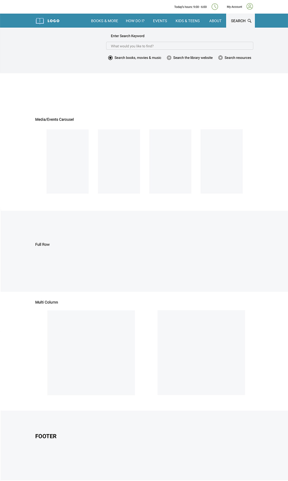
Library websites often have complex search features since multiple data sources are available. A best practice is to include a search capability at the top of every page that displays a search field and the ability to select searching the site (on-site search), searching the catalog, and with large library sites a federated search that displays a discovery layer page for advanced searching of multiple data sources.
Below is an example of how a search feature can expand on the page making it easier for the patron to refine what they are looking for. The primary nav bar connects to the drop-down search options minimizing the visual complexity of the design.
4. Accessibility
“The power of the Web is in its universality. Access by everyone regardless of disability is an essential aspect.”
Tim Berners-Lee
W3C Director and co-inventor of the World Wide Web
Web accessibility addresses disabilities that affect access to a website, including vision, hearing, speech, motor controls, neurological and physical issues as well as situational disabilities, socio-economic characteristics, and slow internet connection speeds.
Computers address accessibility as well. Below are the controls in the Apple Macintosh settings.
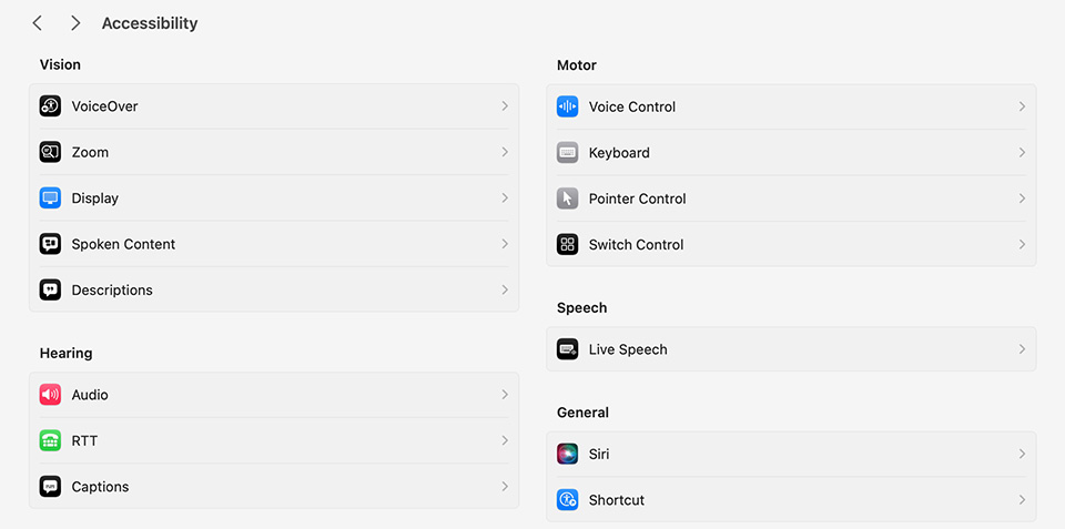
Public libraries are legally required to meet accessibility standards and the amount of lawsuits has increased significantly over the past few years.
The present standard to meet section 508 ADA (Americans with Disabilities Act) compliance is WCAG 2.2. It’s easy to test a website to see if a website is ADA compliant.
Much of the work revolves around content such as including meta tags for images that describe the image in words for visually impaired people. Other areas include the color contrast of text, video transcriptions, and the ability to navigate a site via a keyboard.
Learn more about ADA compliance on the W3C site.
5. Content
People only read 28% of the text on a web page and the time they spend decreases the more text there is on the page.
WebFX
Content is often overlooked and overly text-based. Even the term content belittles its importance, putting it in a box e.g. where’s the website content? As if it was this thing that is picked up and put on the website. Content is one of the main reasons why someone comes to a page but is often relegated to a lower priority than the design.
The types of web content are numerous e.g. text, photographs, videos, illustrations, podcasts, social and blog posts, webinars, infographics, eBooks, and white papers. Since people scan pages, it’s important the text is structured e.g. utilizing headlines, subheadlines, bullets, and accordion-style lists that expand and contract.
It goes without saying, it’s a best practice for experienced and talented writers, videographers, etc. to create your library website content.
Simplify
As Henry David Thoreau said simplicity is the source of enjoyment in life, and that now can be said for websites. The most common characteristic of an easy-to-use library website is simplicity. This holds true for the design, navigation, and content. Everyone loves simple but getting to simple can be complicated and time-consuming. Using simplicity as a guide that informs design decisions is a best practice for making an easy-to-use library website.
Learn more about LibWeb a platform we created for public libraries optimized for ease of use and contact us if you would like a free audit and assessment of your library website.

with a Booster program for Healthcare companies.