Lets Talk Logo Design
Ready to boost your SEO ?

Lets Talk Logo Design
When a logo has been around for years upon years, it's hard to envision changing it. There is brand awareness that goes along with it, people see it and immediately recognize it. That is why when redesigning a logo usually only subtle changes take place. This allows the logo to get a fresh new, updated look but still remains easy recognizable. Remember, first impressions last so it's important that your logo is memorable. See below for examples from some well known corporations.
MSNBC
The easily recognizable peacock is left untouched while the clunky uppercase text is changed to a more readable lowercase sans serif.
THE SCIENCE CHANNEL
The Science Channel’s logo redesign makes sense in the fact that it’s playing off the scientific element table in its new, simpler, modern logo. As for the bright orange, it speaks bold, fresh and new; I love it.
DOLBY
The Dolby logo consists very subtle, but important changes. Keep in mind that this logo needs be effective when produced at extremely small sizes. Removing the box around Dolby, merging the double D’s and a slightly thinner font with more character.
DELTA
The new red on red pyramid gives a sense of depth without it being too much. The colors, kerning and new sans serif font give the new logo an overall much more sophisticated look.
PEPSI VS. COCA-COLA
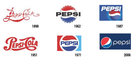
Pepsi is known for changing their logo and tag line every decade (the most recent coming later this year or early 2009) while Coca-Cola’s hardly every changes. Typically, one would say that changing a logo as much as Pepsi is a bad idea, but maybe not in this case. With Pepsi, each logo is like a cultural milestone. It shares a story and captures the style of that time period... Some food for thought.
with a Booster program for Healthcare companies.


