
Frontage Laboratories is a full-service CRO laboratory that manages clinical trials to help clients bring promising drug candidates to market. Frontage wanted to update the website architecture to more effectively communicate with the target audience, improve ease of use, streamline the continuity of their messaging, and boost their SEO.
Starting in 2019, we have provided support for Frontage to improve its website design for both the US site and China sites, and to make it easier for web visitors to find the information they need to achieve their development goals.
Migrating Website Platforms for their China Site
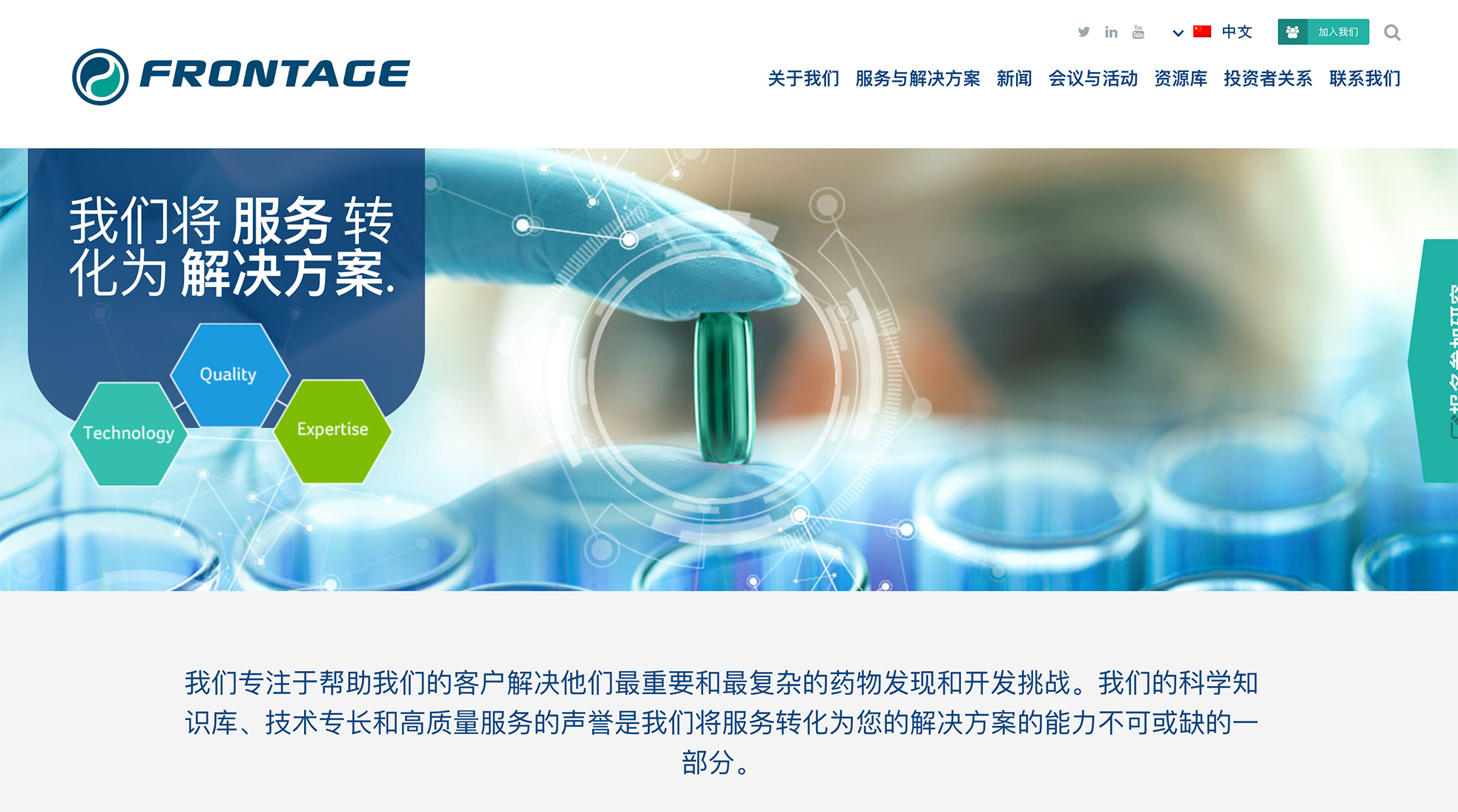
One of the first projects we completed was migrating the hosting and website platform for the China site including the ability to control and edit the content of both the English and China sites from one place. We then developed the new homepage for the China site based on the finalized homepage of the US site. The site is now hosted and viewable in China and uses WordPress for managing multilingual capabilities.
Since security was a priority, we also worked with their IT team to clean up legacy code, and fix any outstanding issues as well as perform regular security scans. These updates made the site faster and more secure.
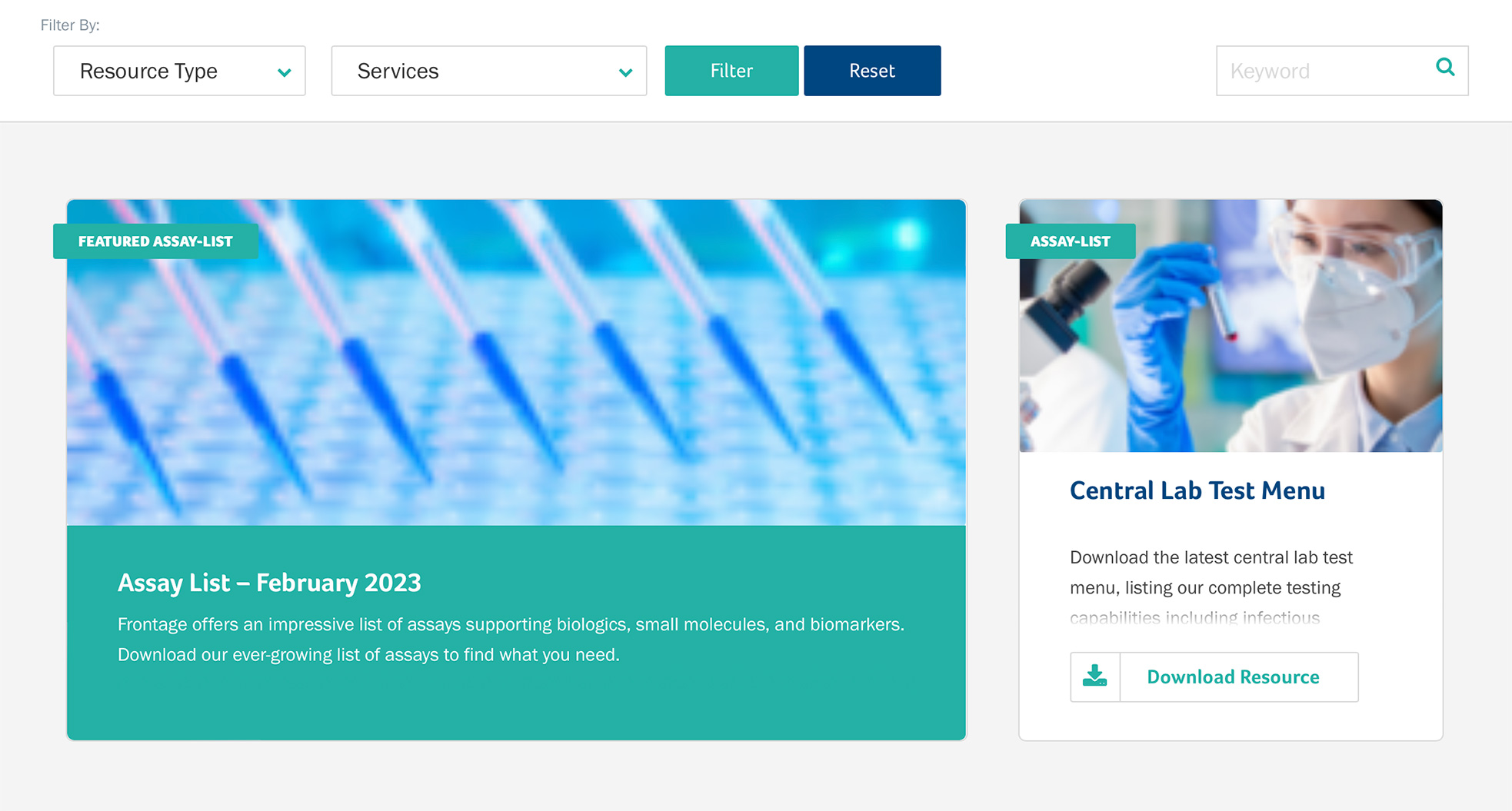
Another feature the Frontage team members wanted was the ability to keep assays up to date on a regular basis. We worked to create the functionality to ensure assays could be imported in bulk via CSV to get populated on the site. We also enhanced the search function to make it simple for users to find a particular assay by searching by text in a search box.
Improve the Navigation Menu
Like most biotech and life science websites, the navigation menu for Frontage is often the first place visitors click to get to other sections of the site. The problem was as Frontage’s selection of offerings grew, their menu became crowded. Visitors viewing the menu were shown too many solutions on a long list that made it difficult to find the right solution.
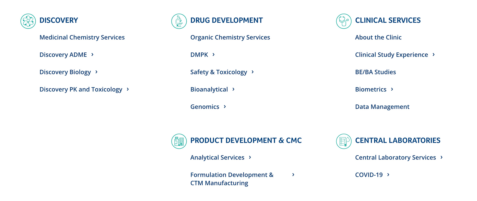
Well-defined navigation is a must-have design feature for healthcare and life science websites. To create a better user experience for Frontage, we created a structured navigation menu (known as a mega menu) that organized their services under top level categories.
We divided their large number of offerings into the four main categories their target clients could investigate further: Drug Candidate Evaluation, Product Development, Clinical Services, and Central Laboratories and Testing. From here, we created bolded subcategories, with a short list of selections under each. This made searching for the right solution faster and easier for visitors.
This also made it easier to indicate Frontage’s relevance to search engines, which in turn helps SEO for the website.
A More Searchable Resources Library
Frontage has a rich library with helpful resources that provide value and insight to who they are as a company. The problem was their resources page wasn’t being used to its full potential. It grouped all collateral by just four different types, which meant visitors couldn’t view the full catalog of resources available. And it wasn’t searchable.
Frontage wanted to add a search function to their resources section so users could quickly locate the resource they were looking for. Frontage also wanted to expand the number of collateral types to better filter search entries.
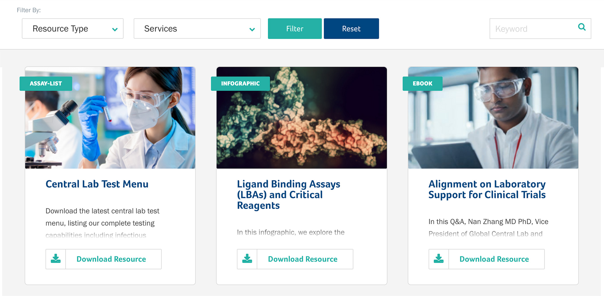
We added a small search window designed specifically for the resource section. The development team also added a dropdown filter with more resource types, as well as a second filter with a list of Frontage’s Services.
Visitors can now filter by both the resource type and service to quickly find the relevant information they need.
Enhanced Navigation for Services & Solutions
Enhanced navigation was a key goal for the Services and Solutions pages. Frontage wants visitors to get the information they need when they land on the solutions pages. They were looking for pages to have narrower margins to allow for more content and make them more visually appealing.
The old page structure had content in a single column crowded by a sidebar with widgets (small, pre-built modules that add functionality to the website). The sidebar was a distraction to the main content, and didn’t convey the modern, advanced design they were after.
For the redesign, the team opted for a selection box navigation within the pages themselves. This way visitors wouldn’t have to hunt around to know where they were on the site. They could click on the navigation box to easily find related information and services, allowing for better continuity and SEO.
We redesigned the widgets to make them larger and more visual and created a pre-footer to place them in. Each widget populates according to the section of the site they appear on. The more prominent visuals with related content encourages visitors to explore related resources and makes for a more seamless experience.
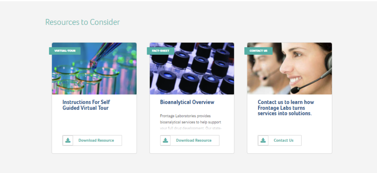
A pre-footer that houses widgets with related resources creates a more seamless experience.
Replace News Slider with Multiple Viewer Panel
Frontage wanted a more interactive section for featured news items on the home page. The site had a 2-column slider section that would rotate several of the most recent news stories. The problem was the dots controlling the carousel were not intuitive. Website visitors often ignore sliders and don’t click through to all the stories.
We updated the section to show a multiple-view panel instead. We went with a lighter background and varied the image tiles to highlight the most recent tile in size larger than the others to draw attention to it. The design included a small tab overlay on each image to indicate that it is a featured story.
Results
Updates and enhancements to the site have helped to improve overall traffic and performance for the Frontage website.
Site engagement and traffic have dramatically increased since the updates to design and functionality. Improved site navigation and organization allows life science companies who visit Frontage to find the right solution and get the information they need to achieve their goals for successful development of important therapies and products for patients.
