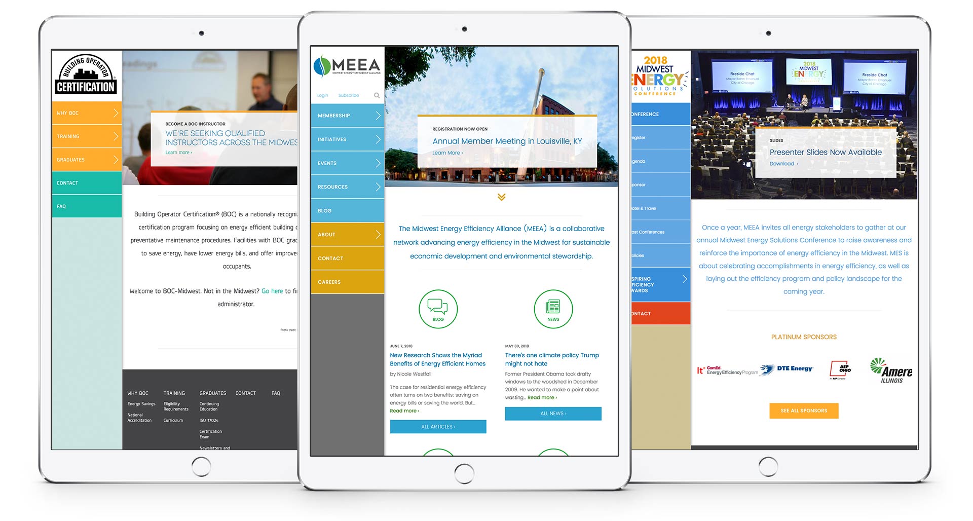
As an organization focused on triple bottom line business practices, we were more than excited about our recent website redesign project with the Midwest Energy Efficiency Alliance (MEEA).
MEEA is a nonprofit membership organization that works to advance energy efficiency in the thirteen Midwest states. MEEA was in need of three new responsive websites built on a Drupal Content Management System (CMS). Their goals included building brand awareness, increasing participation, and reorganizing their content and site architecture for optimal usability.
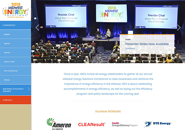
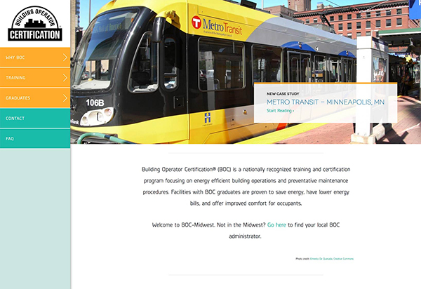
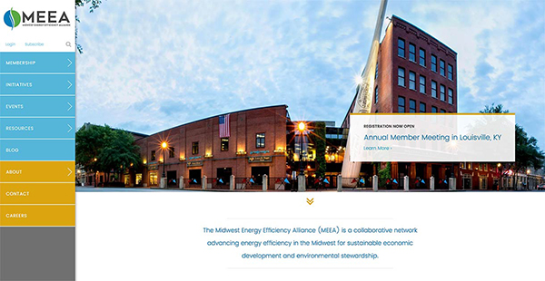
Our team addressed these goals using three main components: a well-organized IA visible in the left side navigation, persistent related content blocks, and a lightweight yet robust multi-site built on a Drupal core.
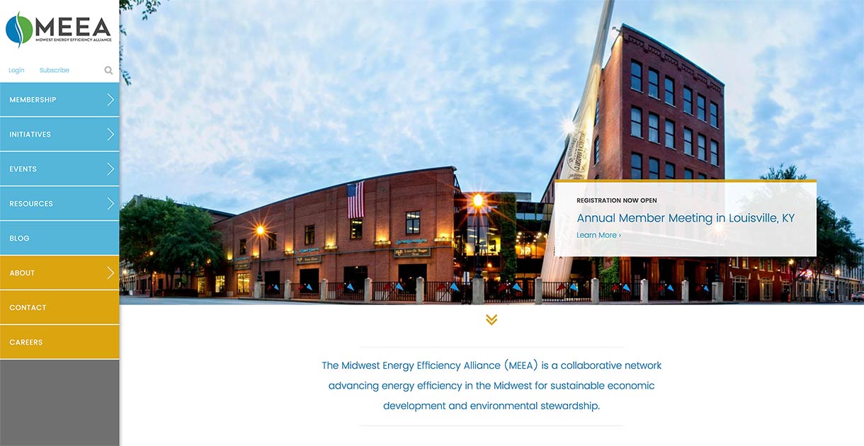
Left column sticky navigation
With eight main links as well as login and subscribe links, the menu was larger than what could be displayed in a typical horizontal navigation. Instead of burying the menu in a collapsible hamburger structure on desktop view—either entirely or partially—we placed the menu along the left side of the page. The menu is sticky which means it stays visible during scrolling and it does not collapse or minimize. While this may eat up valuable real estate, it allows desktop users to have full view of the menu items for easy navigation and facilitates faster browsing by eliminating the extra step of clicking to open a collapsed menu. This style menu also gave us the opportunity to bring the bright brand color palette to the foreground.
Related content
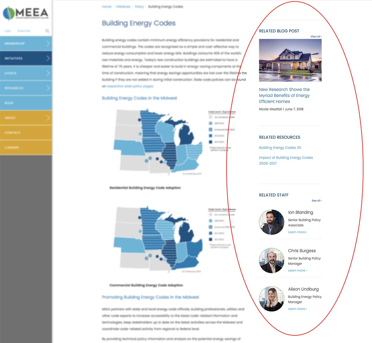
The original MEEA website had a vast amount of content and resources, but most of their content was siloed and difficult to find. In addition to the various blog posts and news articles, the MEEA website has hundreds of helpful resources like toolkits, RFPs, publications, and auxiliary websites. With over 1,630 pages and rising, our challenge was to reduce the visitor's effort in finding information relevant to them. One way to help users along is to display related content which is a helpful and common feature that matches keywords from the website content to pull and display links to other relevant pages. It gives visitors a quick way to navigate to content applicable to the information they are currently viewing—pages they may not have easily or quickly found on their own—and increases time on the site.
With the quantity and quality of content on the MEEA site we determined that three related content sections were ideal for usability: related posts, related resources, and related staff. Adding these blocks helps to display content that visitors might not have known to look for and connects them with experts on the topics at hand, helping visitors move around the site with ease.
Three birds, one stone
Our work wasn’t done with the main MEEA website. We also developed their separate conference website and their Building Operator Certification (BOC) website as well. It made the most sense in this case to implement a Drupal multi-site. As its name implies, multi-site allows a single shared Drupal installation among several sites. The single installation includes core code, modules, and themes that are shared across the sites with each site having its own database and configuration settings.
The many benefits of a Drupal multi-site include reduced development costs, strengthened brand consistency, and efficient updating. By eliminating the need to create multiple sites from scratch—three in this example—we greatly reduced the amount of development time thereby saving the client money. Multi-site also helps with brand consistency by making it easier to maintain branding guidelines across websites due to the shared child themes. With the three MEEA websites for example, the structure, look and feel are consistent across the suite with some minor style changes. Finally, updating is centralized with the ability to make upgrades, share content, and edit on one site without having to repeat those changes on all the others.
Even with the quantity of content and running three sites on one installation of Drupal, the websites average an “A” grade (95/100) on speed tests. This means the sites are light and load quickly, optimizing the user experience, particularly on mobile devices. Since launching the MEEA sites, they have been growing their online presence resulting in increased member participation and retention.
Does your organization have multiple websites that need consolidating? A Drupal multi-site might be the solution. Let’s talk.


